Make a Joyful Noise (Behind-the-Scenes)

Psalm 100 is evidently one of my favorite passages in God’s Word that speaks of music. Today, I took the first verse and added it to a violin picture that I took.

I played around with some layering and thought I’d give you a little behind-the-scenes.
(Disclaimer: I don’t claim to be a layer master so if you know of something I did wrong, don’t hesitate to show me a simpler way)

Program: Photoshop Elements 10
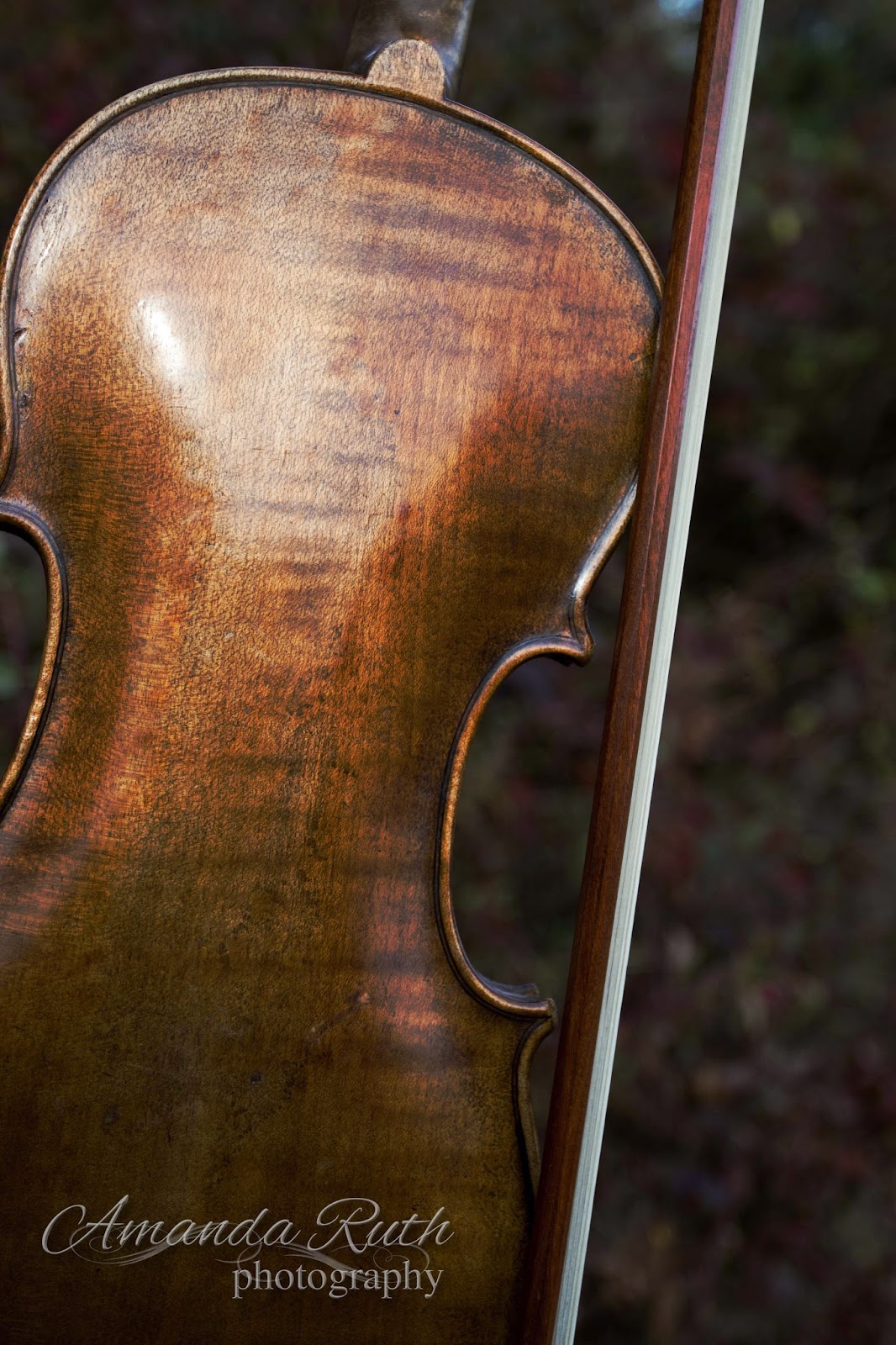
First Layer: Violin
Of course, I began with the violin! 🙂 I lightly edited the image in Photoshop Elements 3, particularly upping the contrast. So, here is the almost-original image:
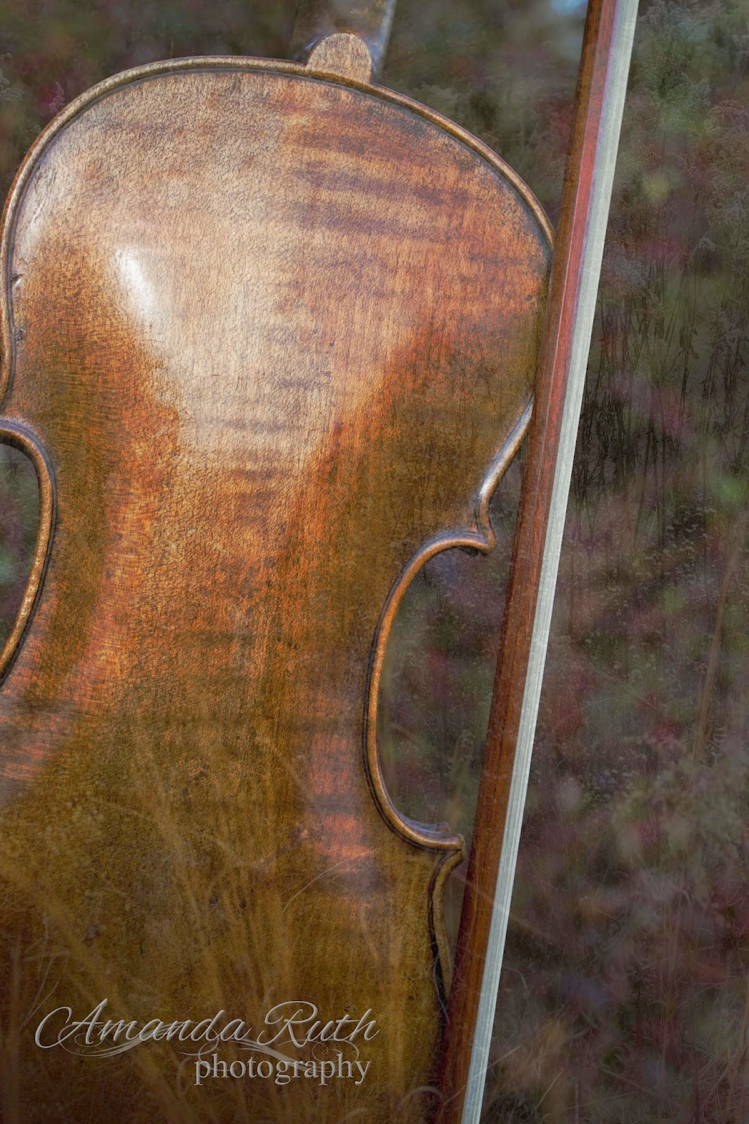
Second Layer: Blue
Next, I created a blue fill layer (color: 5c687a).
{Layer > New Fill Layer > Mode: Color Burn > Color 5c687a}


I set the opacity for this layer to 50%. This is what it did to the violin image:

Layer 03: Grass
I selected another image I had taken of simple weeds.

For this layer I selected opacity 15% just to give it that hint of texture. Not much.
Layer 04: Green Difference Clouds
Then I created a new layer with difference clouds.
{Layer > New Fill Layer > Color: 858142 – with that layer: Filter > Render > Difference Clouds}
This is what I got: 

Again, I chose the opacity to be 15% (if you can’t tell by now, I like just the tiniest hints of change)
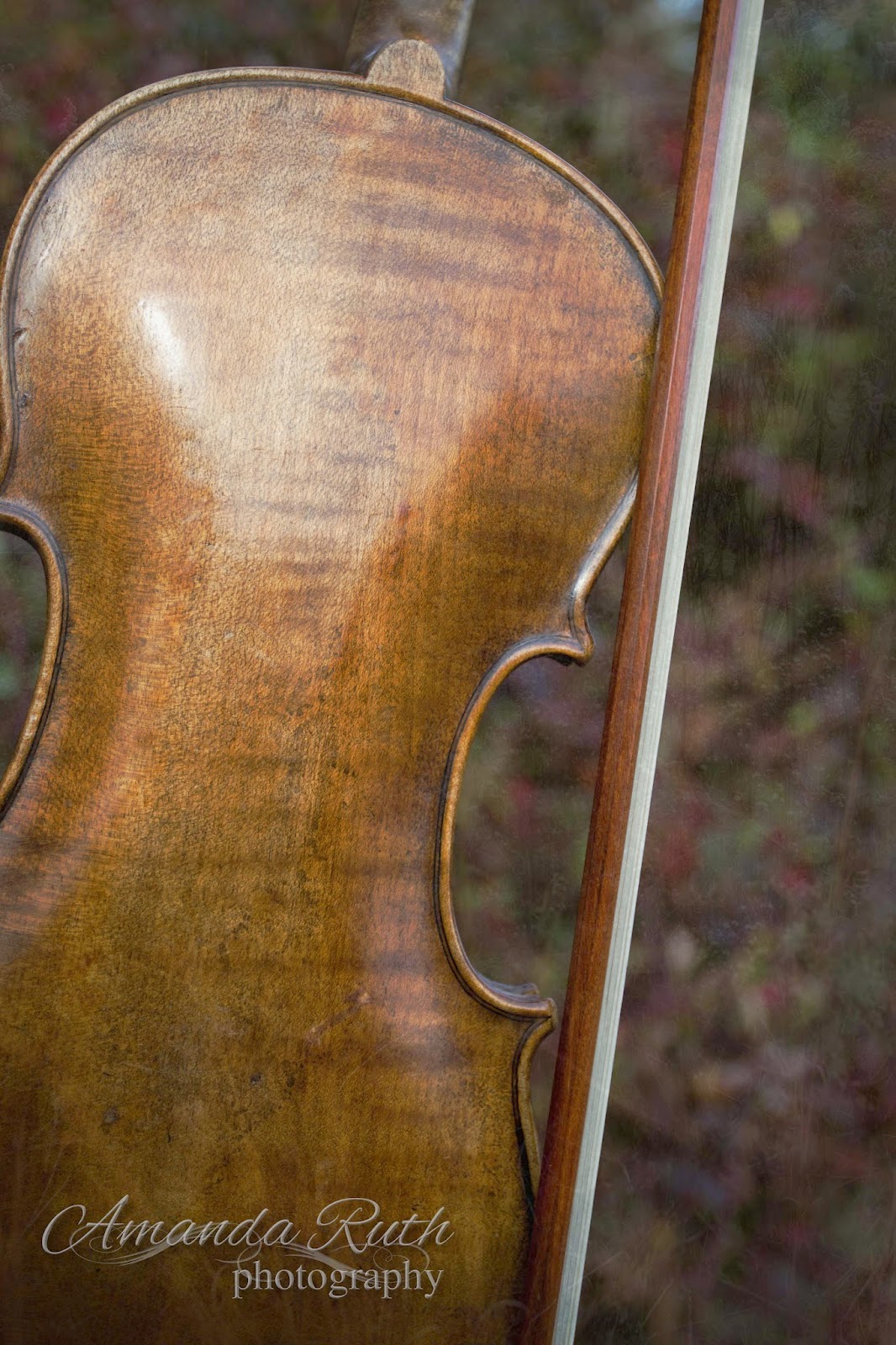
Layer 05: Another Violin
This is probably not how you’re supposed to work Photoshop layers, but I decided that the image was a little darker than what I wanted so instead of working out the mathematics to lighten each layer, I just overlaid another violin picture: opacity 40%.
Layer 05: Text
The final step was adding the text. I used two fonts: Cardif (for the plain text) and Allura (for the fancy text). I played around with text styles (glow, simple sharp inner bevel, drop shadow) until I came up with the look I liked (yes, I could go more into detail, but it would seriously confuse you).
If you own Photoshop and haven’t played around with layers yet, I encourage you to give it a try! Don’t be scared to just click buttons (just observe what buttons you click so if you come up with something fantastic, you’ll know how to replicate it).

Grace Card

Is it wrong that it was during church when I got the idea for my newest graphics design? 🙂 Wednesday night, our pastor was teaching on 1 Timothy 2 and expounded on the marvelous grace of God. Here is the result of my reflections (I’ve been playing around with different styles that are not particularly mine – hence, the lines):
Available at Etsy

Printed as a card
Instead of a simple graphic, I made this to be printable cards – because I’m always needing more cards.
What is one word from God’s Word that He has been impressing upon your heart lately?

Maggie’s Hopechest (cover design)

It was Maggie’s teenage dream to acquire her very own hopechest. Surely now that the Lord provided one for her, He wouldn’t ask her to give up the collection she’s worked on for years – or would He?

“Maggie’s Hopechest” is a short story that the Lord allowed me to write recently. It’s an old idea that I’ve had for several years, but never made the time to sit down and write it. Short stories are an excellent way to express story ideas when you don’t have time to sit down and write a full-length novel. I’m not a short-story writer by any means (aka: I’m very wordy) but this was a great challenge for me to stay concise and keep the plot flowing.
But! I haven’t edited the short story yet, so for now, here’s the cover I was playing with:
Original
After looking at it, I realized that it looks very vintage and masculine. Neither are a good portrayal of the short story (it is a modern story about a girl), so I played with some color, trying to “soften” the tones.
Purple

Pink

As I looked at it, I began to wonder if the chest was what gave it that look, so I tried to lower the opacity on the chest:

Pink 02

And, as I always like “behind-the-scenes” stuff, here is the base image that I used. I actually created this image as a background for my sister’s blog, using a picture of burlap (with writing) and a few Photoshop Elements features.
And then, since I didn’t have any picture of a hopechest or trunk on hand, I searched for a royalty free image and found one:
Via freerangestock.com (use caution when looking!)

If you would be so kind as to give your opinion and/or advice concerning my “cover play,” here are some questions I’m wondering:

– Does the cover look too masculine?
– Which cover gives the thought of a girl with her treasured possessions?
– Any overall suggestions?

And a random question on the topic:
– Do you have a hopechest? (no, I do not :))

~*~*~
But this I say, He which soweth sparingly shall reap also sparingly; and he which soweth bountifully shall reap also bountifully.” 2 Corinthians 9:6Â