Scripture Designs 05


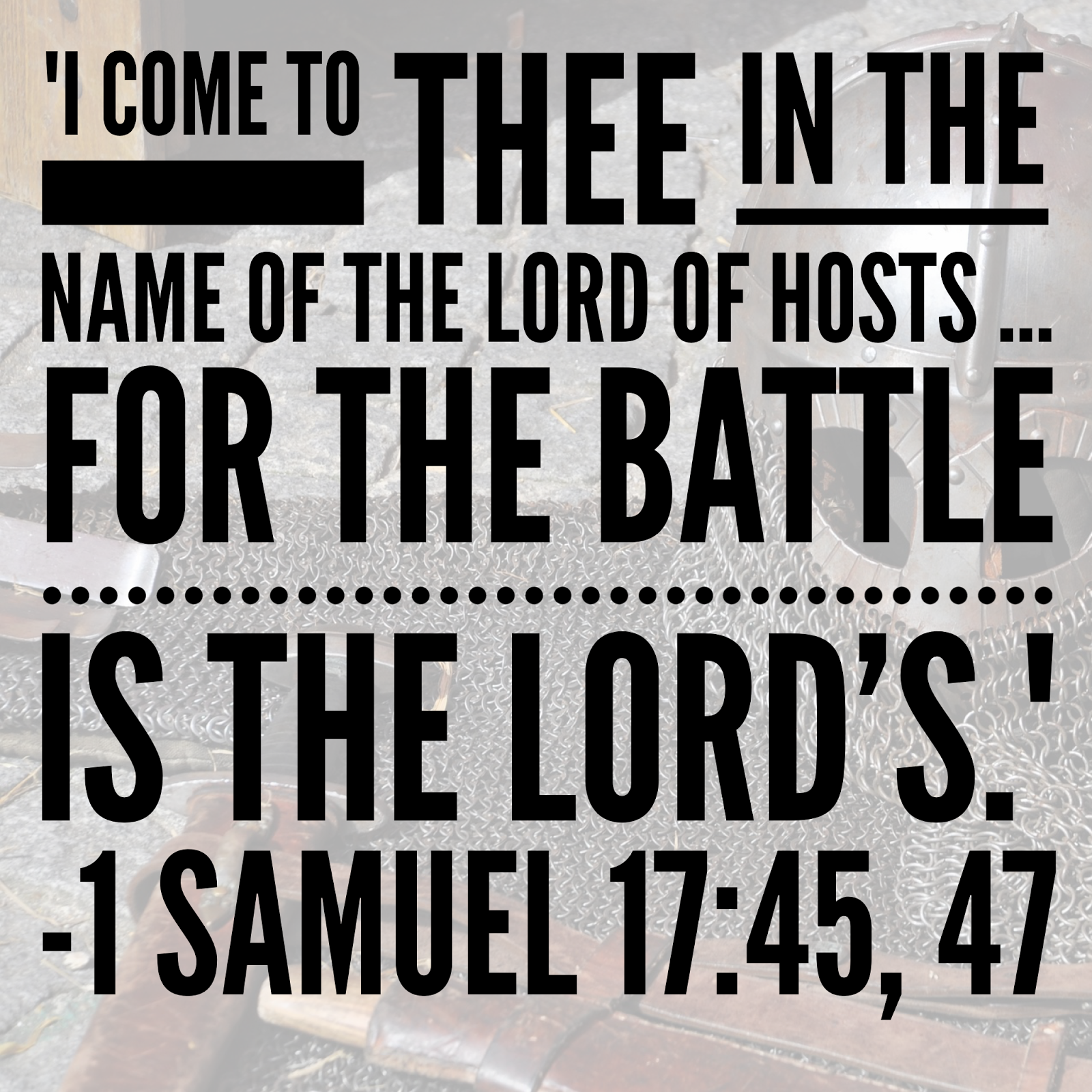
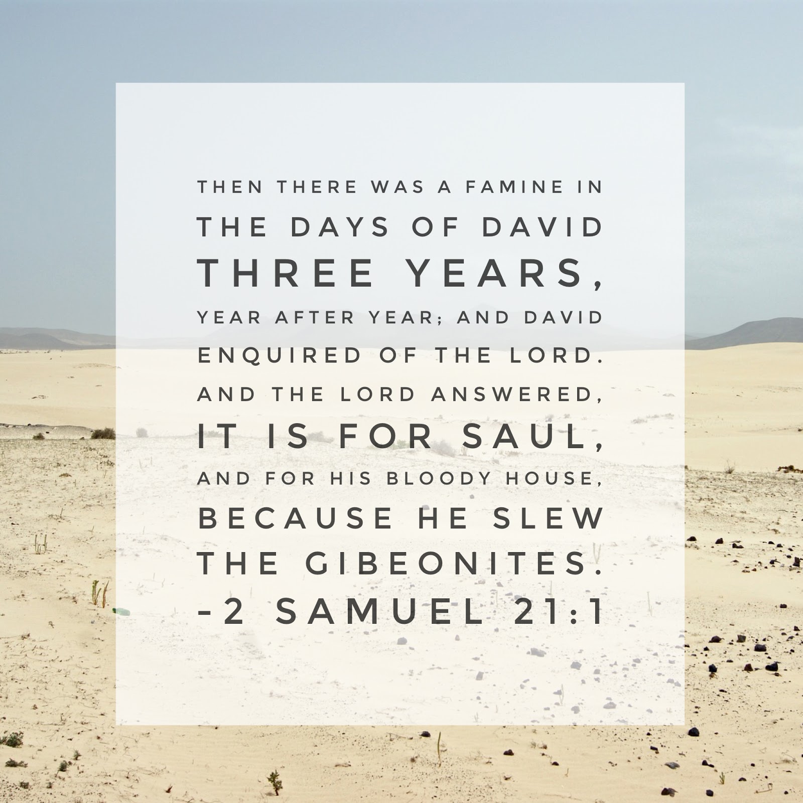
David wasn’t content to just live through a famine–he wanted to know the reason of the famine and took action to remedy the famine.
Is this my attitude towards spiritual famine? Do I seem to know why there is a famine, then take action when I know the reason? Or do I content myself with “just waiting the famine out?”


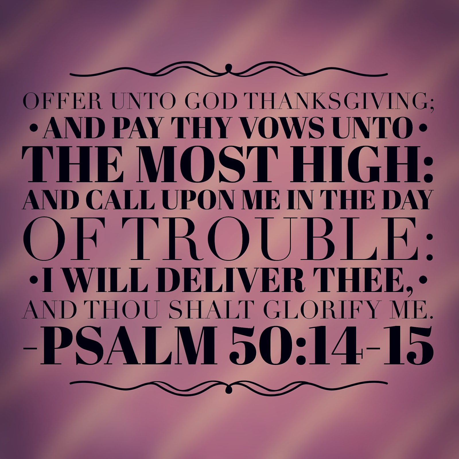
 There is so much in these two verses. First, we see a progression:

– thanksgiving to God
– fulfilling commitments
– calling in trouble
– glorifying God
We shouldn’t start every prayer with, “Lord, help me,” but with thanksgiving for how much He has already done for us!

Another thing to notice is that God does not deliver us from trouble for our glory or even our ease. Ultimately, God’s deliverance is for His glory. The last verse in this chapter further helps us understand: “Whoso offereth praise glorifieth Me…” (vs 23). When God delivers us, and we in turn praise Him, He is glorified (even though we were in a tough situation).

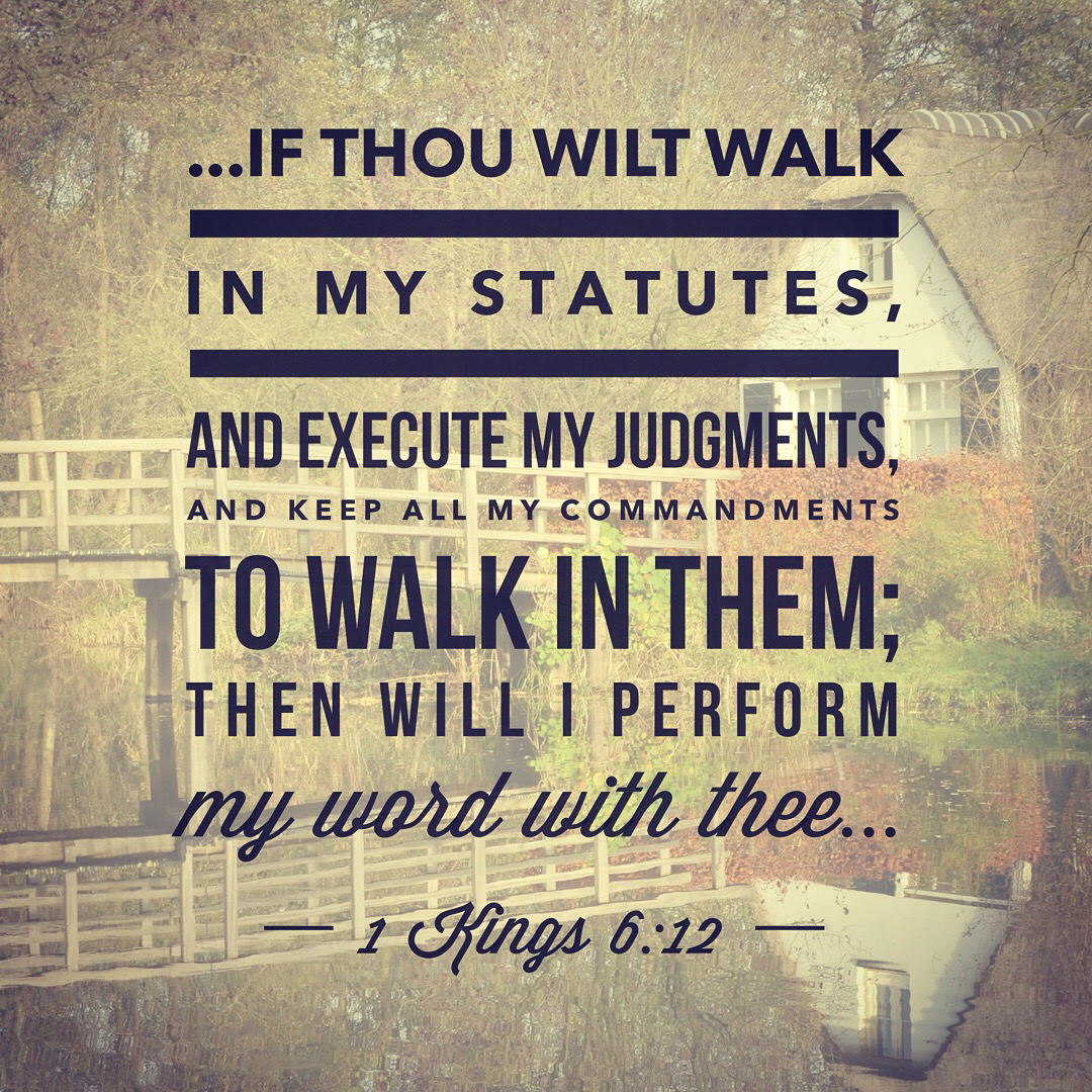
 Like as in Solomon’s time, God’s promises are contingent on our obedience. We cannot expect to claim His promises if we refuse to follow His ways and walk according to His Word.

Scripture Designs 04

This week I decided to add the thoughts that I originally shared when I posted the verses on FB and IG (below the images).


If all that is within me is focused on blessing God, then it leaves no room for grumbling, self-pity, selfishness, or pride.


In times of discouragement, where is our focus? On how cast down we are? Or on the God of our hope, our praise, and our health?


“For, brethren, ye have been called unto liberty; only use not liberty for an occasion to the flesh, but by love serve one another. For all the law is fulfilled in one word, even in this; Thou shalt love thy neighbour as thyself.” Galatians 5:13-14


Whether our trouble is flooding in Louisiana, fires in California, terrorist attacks, or simple, everyday struggles, God IS our very present help in our time of need!

"Befriending the Beast" | Cover Reveal

I am super excited and thrilled to be able to show everyone my cover for “Befriending the Beast!” To be honest, I designed the cover before the first draft of the story was completed. 😉
Be on the lookout for “Befriending the Beast’s” release! Or … just mark your calendars for September 30!
Oh yeah, that’s right. You’re probably more interested in a new book cover than in my jabbering (because, after all, I like drooling over covers more than reading someone’s exuberance almost any day too 😉 )…
*drumroll*
May I present to you ….


About the Book
Belle has returned unannounced to the castle to restore her relationship with the king, her father. Her hopes are dashed with the devastating message: “The king refuses to see you.” Convinced that God has led her home, she is unwilling to return to Lord and Lady Kiralyn.
Time is running out for the decision that will change her life. When tragedy strikes, will she and her father be pulled further apart or knit together? Could she stay at the castle even if she will never see her father again?

——
Would you like to be a part of “Befriending the Beast’s” release?
Sign-up for the blog tour or book review.

—-
A quick “thank you” to the lovely ladies who joined me with the cover reveal: Jesseca, Janell, Faith, and Kellyn!

Scripture Designs

I recently got my first paid-app for my iPhone, and I’ll admit, I’m loving it!! One of the reasons I love it is because it gives me a chance to share God’s Word more. 🙂 If you’re on Instagram, I usually design one a day from the Scripture I’ve read. Follow me @amandateroauthor. For those of you who aren’t, I’ll be putting them up on here on the blog … just not consistently one a day. You’ll just get a great dose of Scripture once a week. 😉 Here are some for this week!

The Silent Blade | Cover Design

Have you ever had those times when you just wanted to do something, so randomly prayed, “Lord, I realize I don’t have to do this, but it’d be nice if…” That was me a few weeks ago. Since all of my writing projects are in the baby-stages of planning and writing, I’ve not had a reason to do one of my favorite hobbies: book cover designing. So, I prayed that, if the Lord saw fit, He’d bless me with the opportunity to design a book cover for someone.
Not even a week after that, I beta-read a book by a Goodreads friend, The Silent Blade. Long story short, we ended up discussing covers and such and she hired me to design her cover! I had so much fun going back and forth, getting to know Jesseca and what she liked, AND finding out that a church-member had a sword for me to photograph! (you never know what happens when you post on FaceBook, “Does anyone have…?”) I am very grateful that the Lord allowed me to come up with a cover that Jesseca loves. That makes it completely worth it for me!
Okay, okay, some of you probably skimmed over all of that so you could see the cover (because, after all, if you’re like me, looking at covers is one of the best things ever!). Here it is!

And the full cover:

For those of you who love reading, The Silent Blade will be releasing on July 22, 2016. I may post about it on my blog, but in case not, Jesseca surely will post about it on her blog, so follow her there!

What’s a prayer that God answered for you recently?

A Scripture Design in 21 Steps

It is always interesting to take screenshots of the process of my graphics design, because I never know exactly what will come out of it–and if it will even be something I like. The design I shared Tuesday, was one I had time to throw together, and here’s how I did it.
Step 1: Started with a blank 5×5 file

Step 2: Pasted the verse on it

Step 3: Separated the words into different layers
And changed the font to Trajanus.

Step 4: Aligned the layers centered
Because, at this point, I was thinking about doing a simpler graphics design.

Step 5: Distributed the text layers evenly

Step 6: Changed the key words to Windsong font

Step 7: Decided that my simple style wasn’t working…

Step 8: So I played around with the positioning of the words

Step 9: With the words done, I took a picture from my iPhone and copied it onto my square

Step 10: Selected a brush

Step 11: Started “painting”

Step 12: Tested the Gaussian Blur look

Step 13: Decided it wasn’t quite the look I wanted…
So I canceled the Gaussian Blur.

Step 14: Changed brush size and added more yellow
I intentionally made the yellow heavier on the bottom than the top.

Step 15: Gaussian Blur again

Step 16: Lowered the opacity of the background layer

Step 17: Made the text visible again

Step 18: Added a drop shadow to the text

Step 19: Decided to test some “Fibers”
In this picture, I have yellow and blue on my color pallet. However, I changed that in the next screenshot to be yellow and orange.

Step 20: Played with the fibers until it looked good.

Step 21: Lowered the opacity of the fibers

There you have it…another graphics design step-by-step.

Scripture Design from Scratch | Graphics Design

A few weeks ago, you may have seen this Scripture graphics design.
When I did it, I decided to screenshot the process so I could share with you–and hopefully you can get some ideas to do your own Scripture designs.
The program I used was Photoshop Elements 10.
First, I create a 4×4″ blank file (resolution at 500 pixels). Then, I dragged an image I had onto it.
I like to use random images for my background–they give creative textures. For this one, I went to Filter>Gaussian Blur.
I did a serious blur on this (106.8 pixels).
Next step: I copied the verse and pasted it onto the file.
I “took apart” the verse, enlarging the key words of the verse. This gave me a lot of text layers to work with.
This next step could have been done before or after, but I did it now. I had gotten a color palette idea from Pinterest. I don’t usually do this, but I wanted something different than my “earth tones” that I default to.
With my color grabber, I selected the purple.
Copying this purple color to my working page, I then grabbed the color replacement took (right click your paintbrush).
Selecting my background layer (lower right corner where it says “Layer 1”), I colored over the background this purple color.
Going back to the color palette, I chose some colors for text. The first color: orange.
I put all of my key words in font Windsong and changed the font color of those words to orange.
Second font color: green.
As you can see, I decided to swap my font colors. 🙂 Green was a better key-word font and orange for the smaller words, in my opinion.
I didn’t want the background quite so bold, so I lowered the opacity of the background to 70% (lower left corner).
Right-clicking the fonts, I decided to add a drop shadow to make it pop from the background.
The only change I made was bringing the size up to 10 (from 5). I did this with all of the text.
Changed my reference color (whoops — forgot about that earlier).
Began tweaking the placement of all of the text.
Decided for the simple text to be in italics (Times New Roman font).
More placement tweaking.
And then I decided that the orange was a little too bright for my preference, so I dragged the color down to have a little more peachy-grey tones.
Added my blog site and voila! Here you have it.
Have you ever designed a Scripture graphics? Is it online somewhere that I can see it? If so, leave a link in the comment and I’ll check it out!
If you’ve not done one, and you have a program to DO one, here’s your assignment for next week: find a verse and create a graphics! (simple ;))