A Scripture Design in 21 Steps

It is always interesting to take screenshots of the process of my graphics design, because I never know exactly what will come out of it–and if it will even be something I like. The design I shared Tuesday, was one I had time to throw together, and here’s how I did it.
Step 1: Started with a blank 5×5 file

Step 2: Pasted the verse on it

Step 3: Separated the words into different layers
And changed the font to Trajanus.

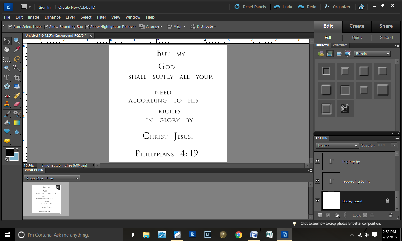
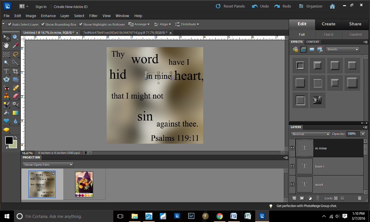
Step 4: Aligned the layers centered
Because, at this point, I was thinking about doing a simpler graphics design.

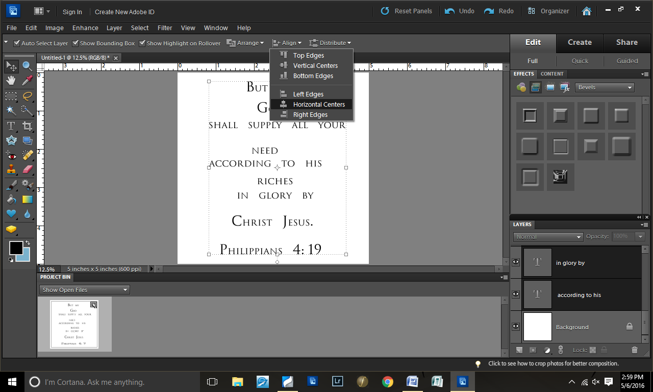
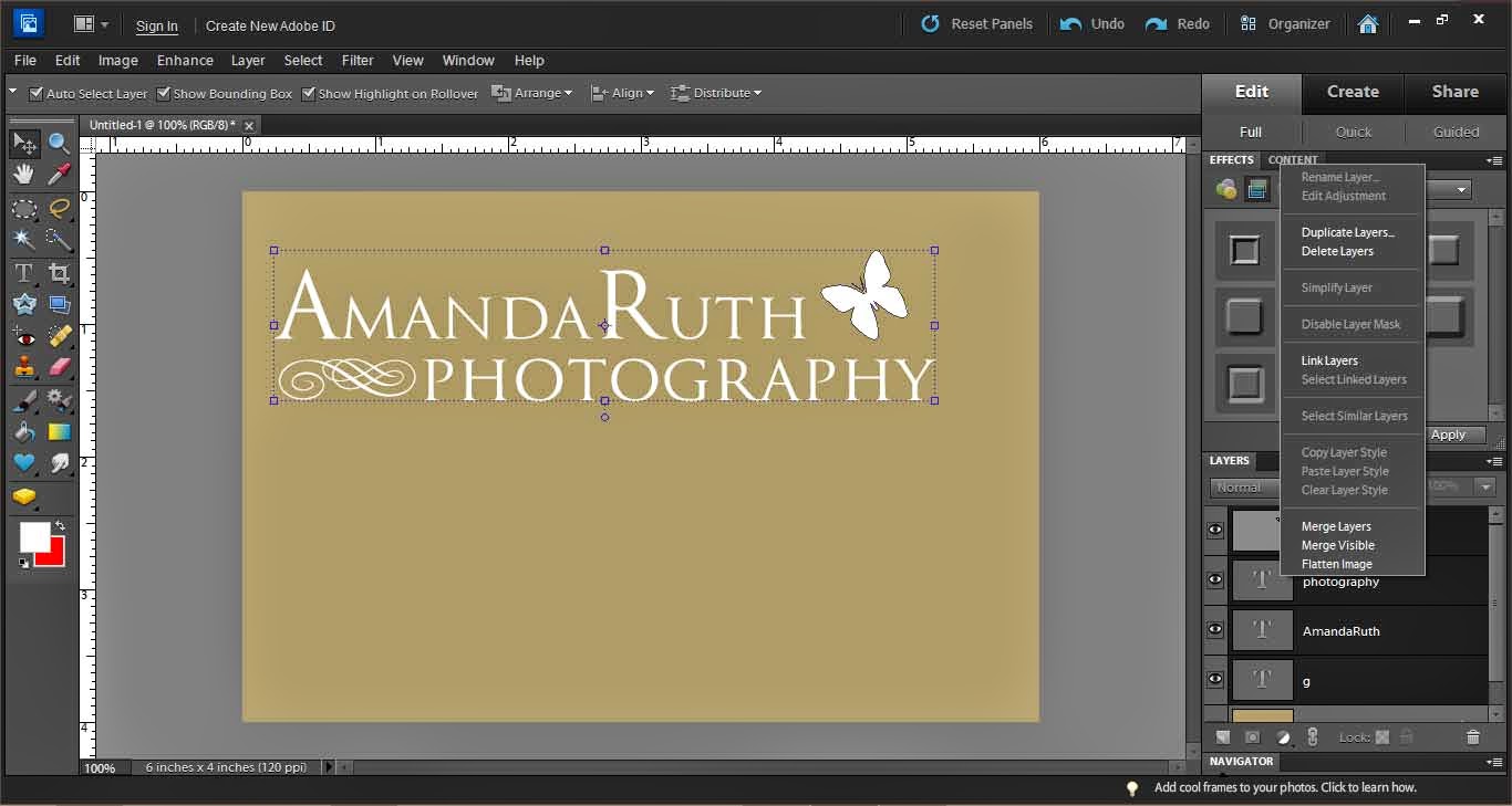
Step 5: Distributed the text layers evenly

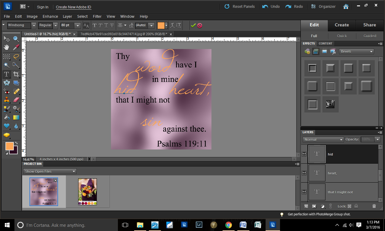
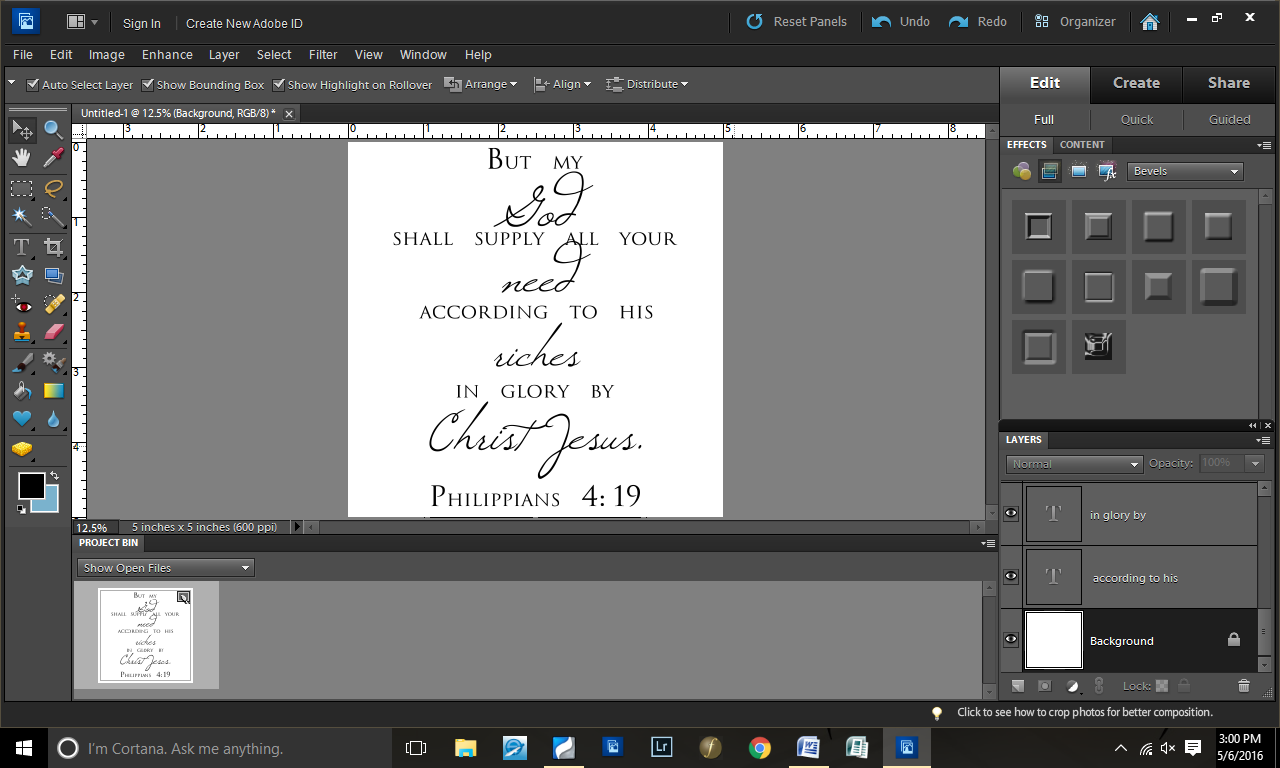
Step 6: Changed the key words to Windsong font

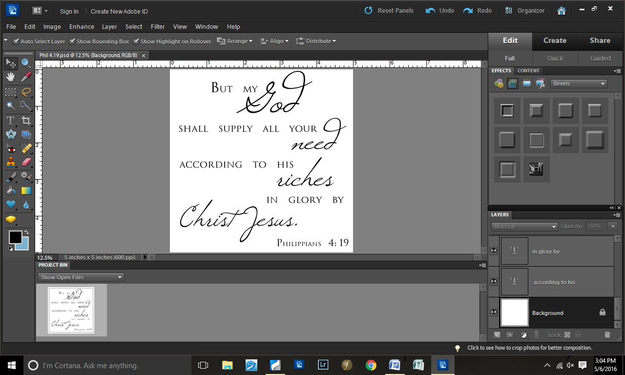
Step 7: Decided that my simple style wasn’t working…

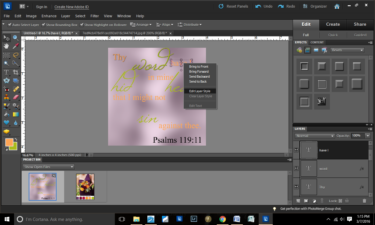
Step 8: So I played around with the positioning of the words

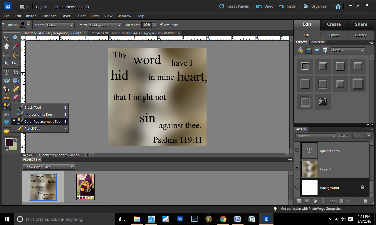
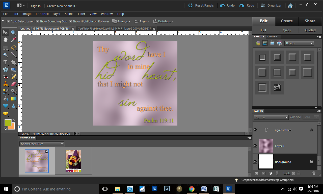
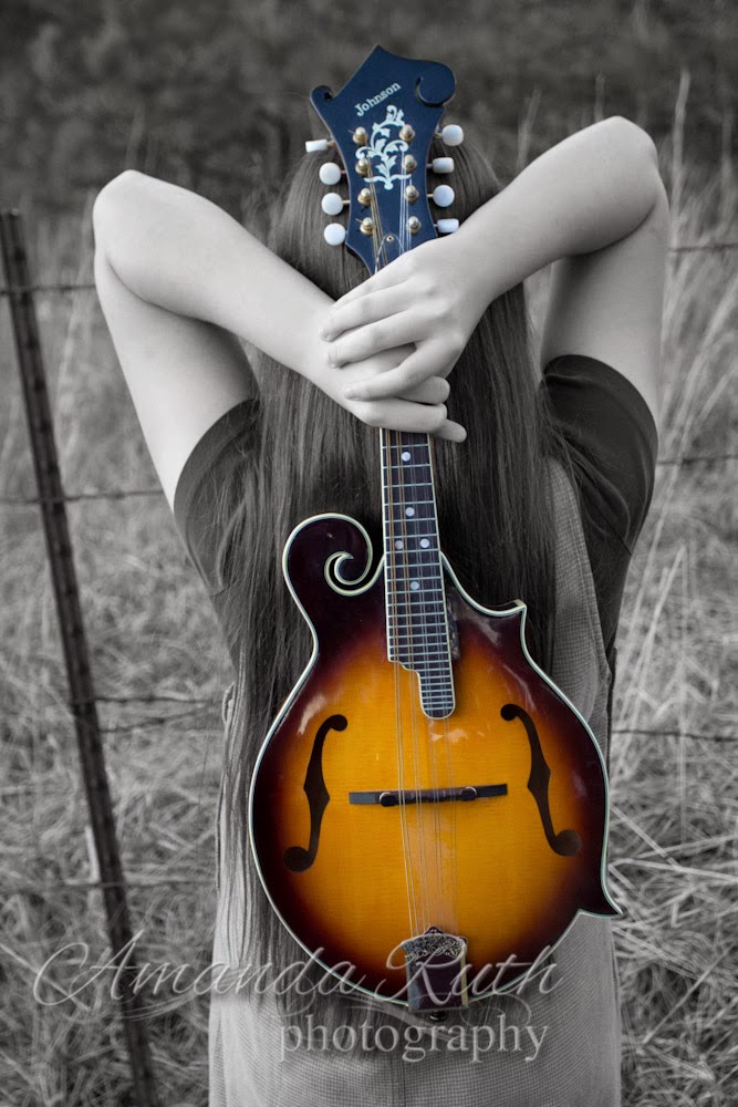
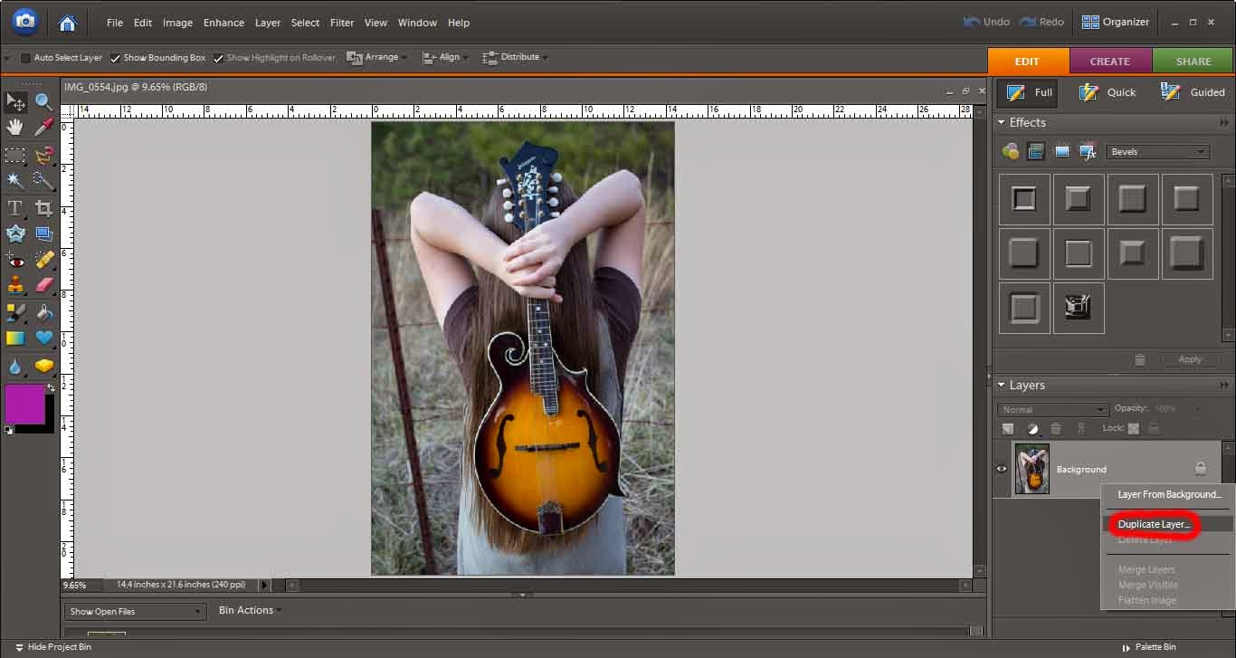
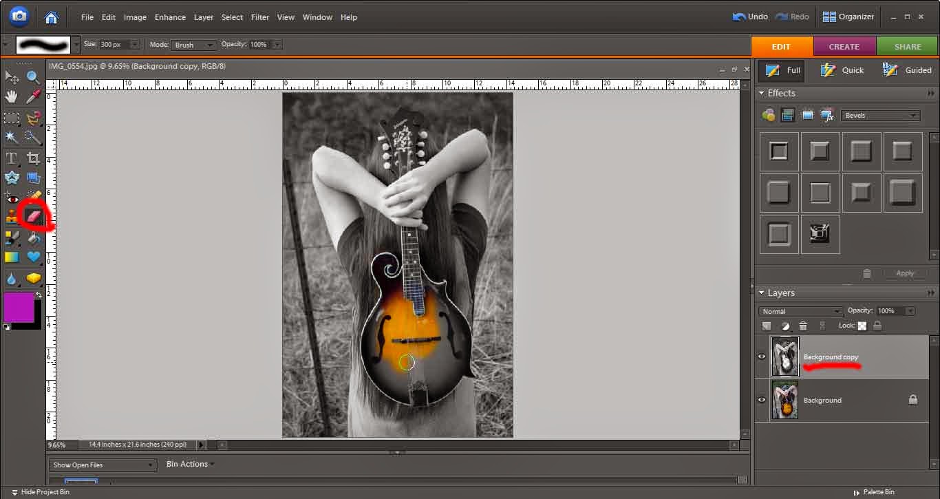
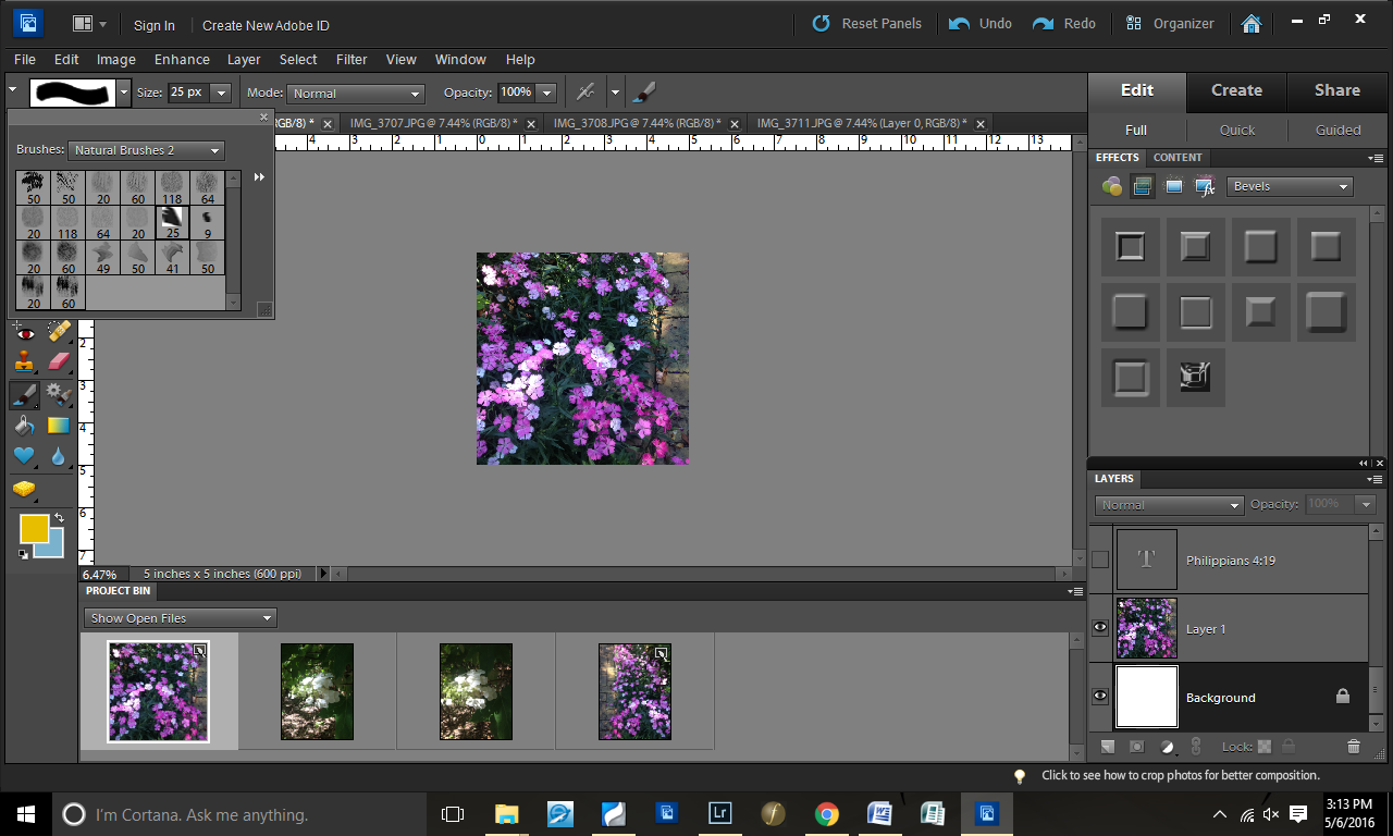
Step 9: With the words done, I took a picture from my iPhone and copied it onto my square

Step 10: Selected a brush

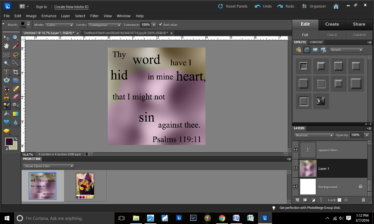
Step 11: Started “painting”

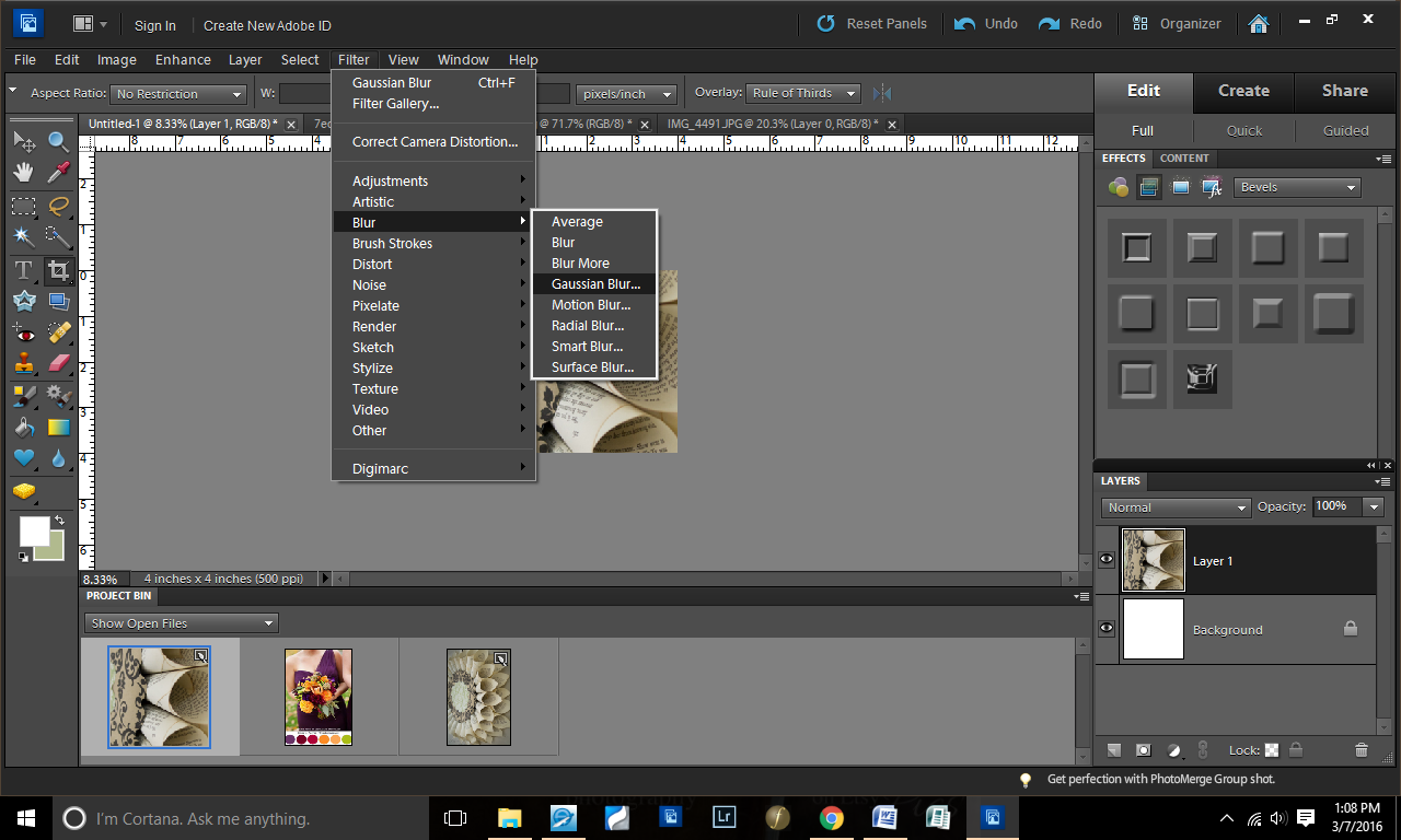
Step 12: Tested the Gaussian Blur look

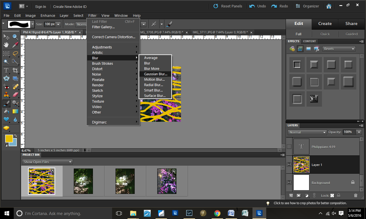
Step 13: Decided it wasn’t quite the look I wanted…
So I canceled the Gaussian Blur.

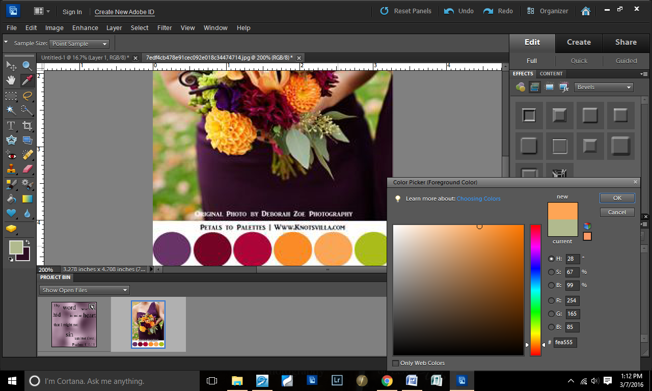
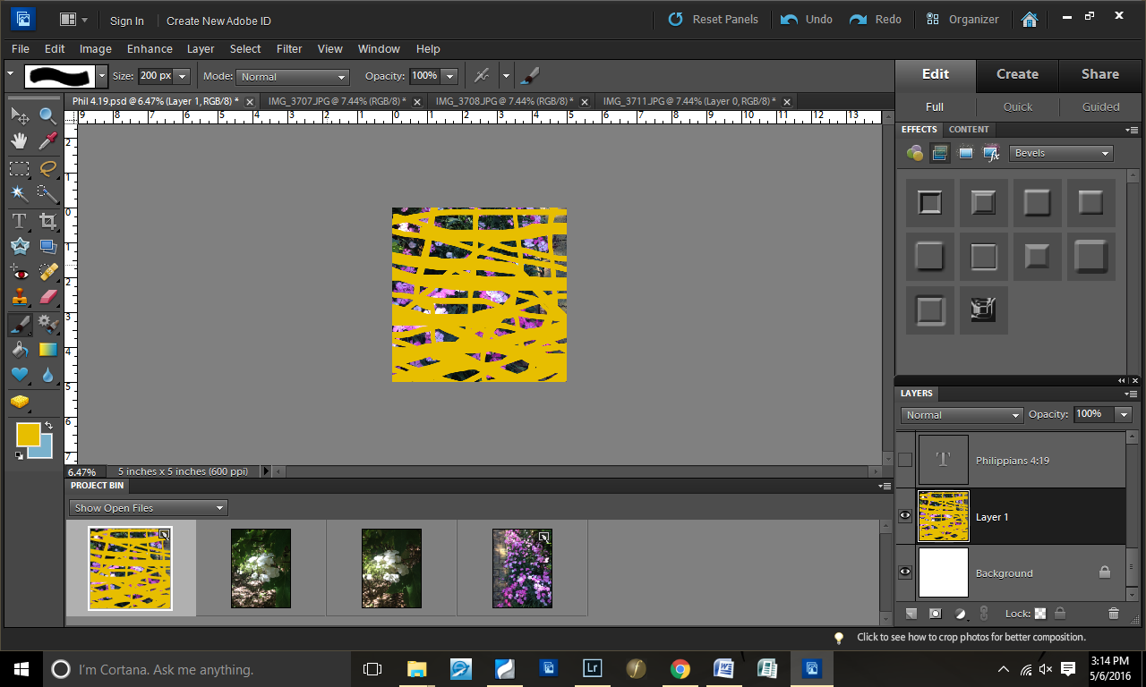
Step 14: Changed brush size and added more yellow
I intentionally made the yellow heavier on the bottom than the top.

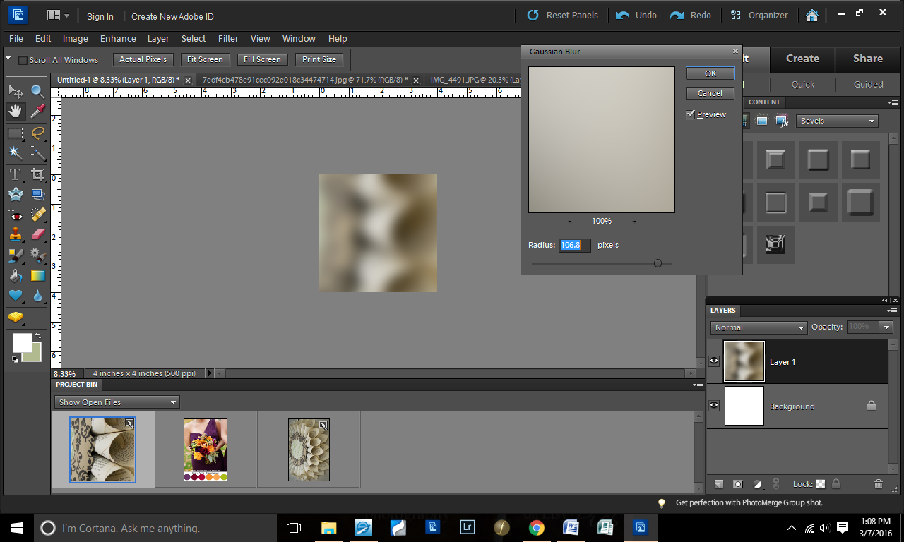
Step 15: Gaussian Blur again

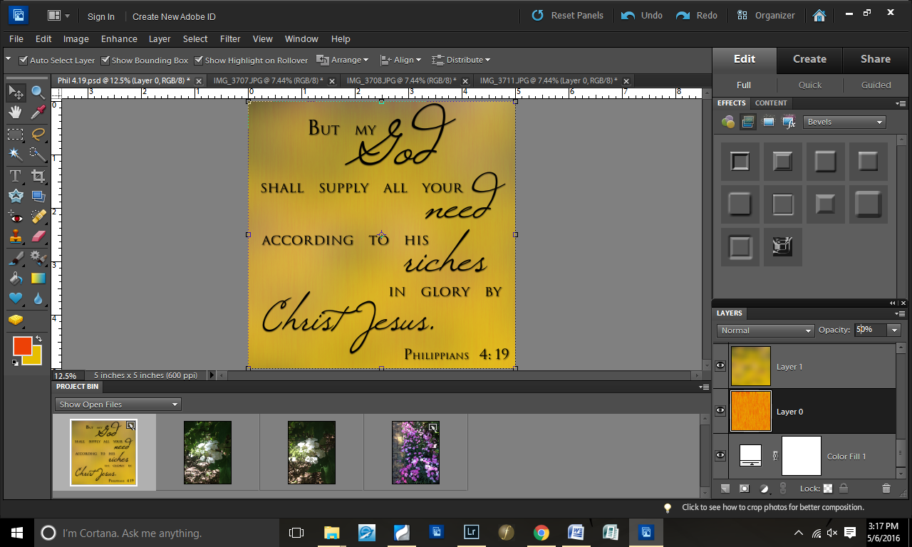
Step 16: Lowered the opacity of the background layer

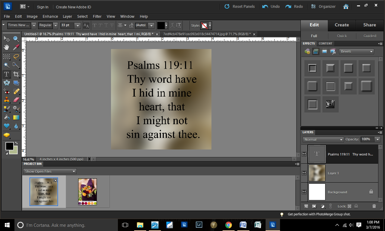
Step 17: Made the text visible again

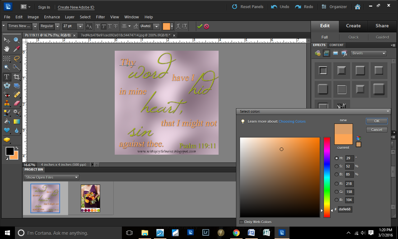
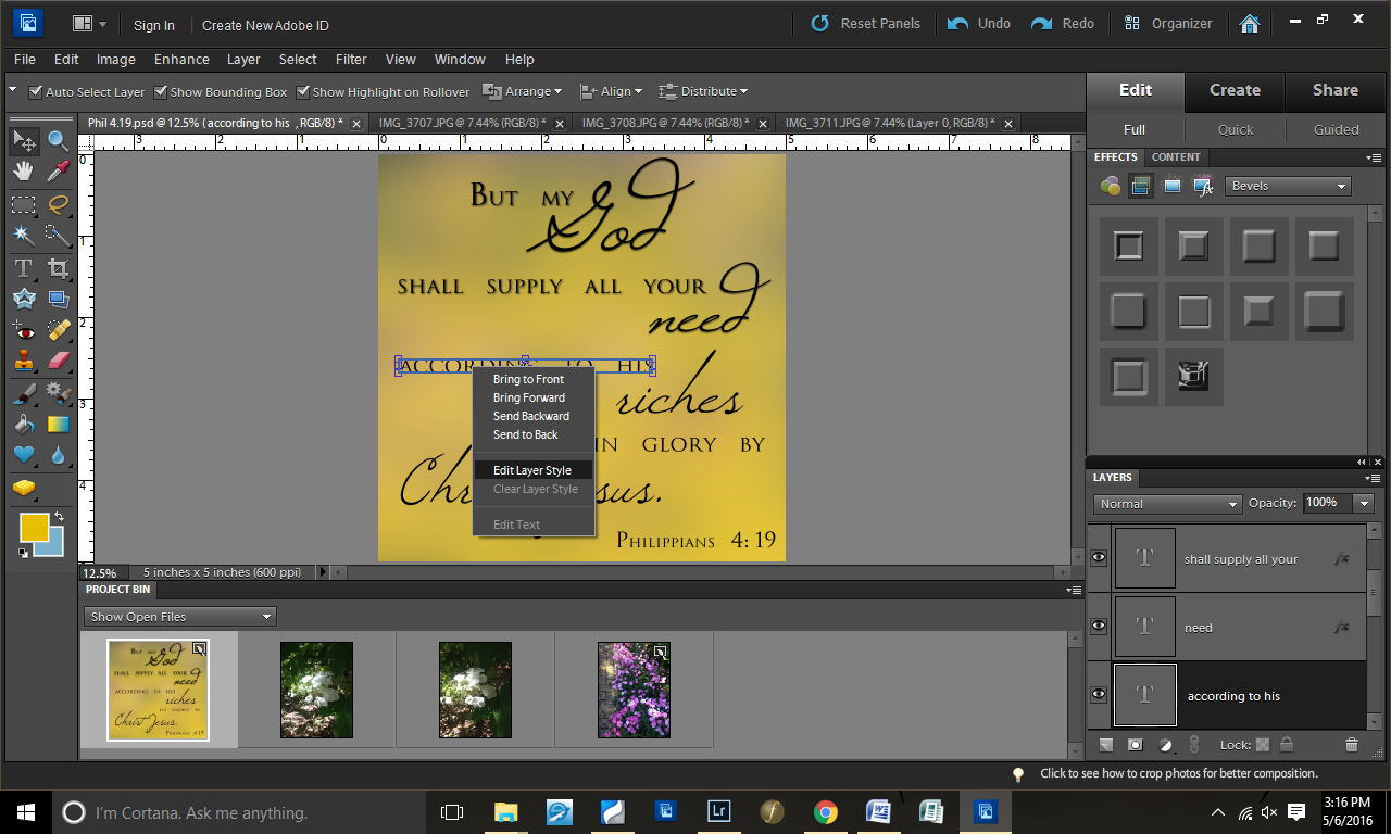
Step 18: Added a drop shadow to the text

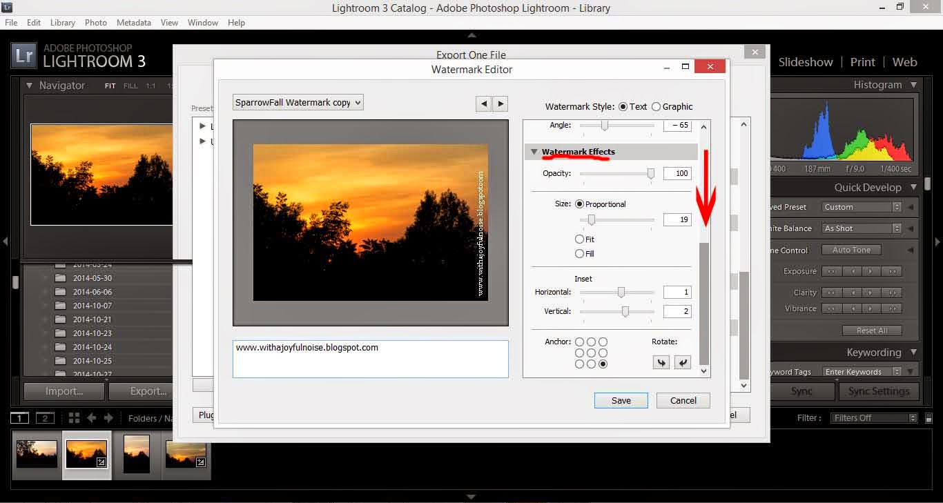
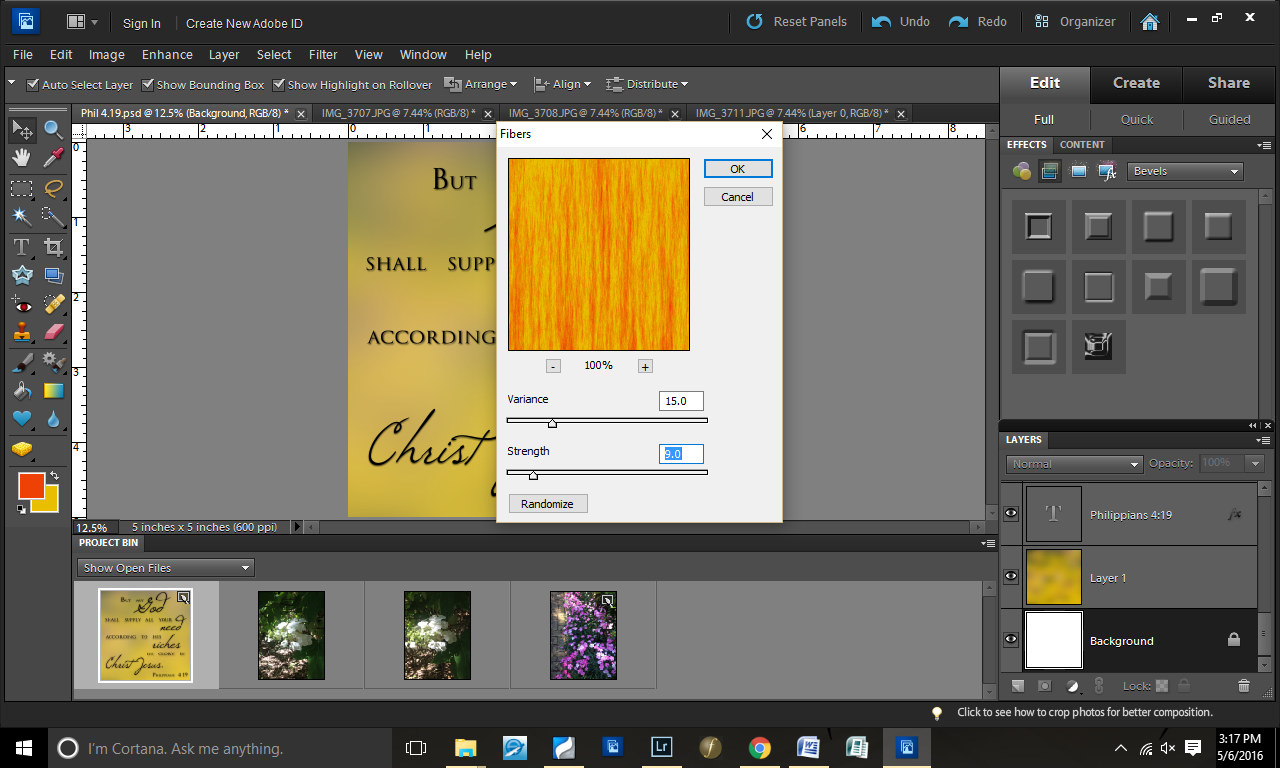
Step 19: Decided to test some “Fibers”
In this picture, I have yellow and blue on my color pallet. However, I changed that in the next screenshot to be yellow and orange.

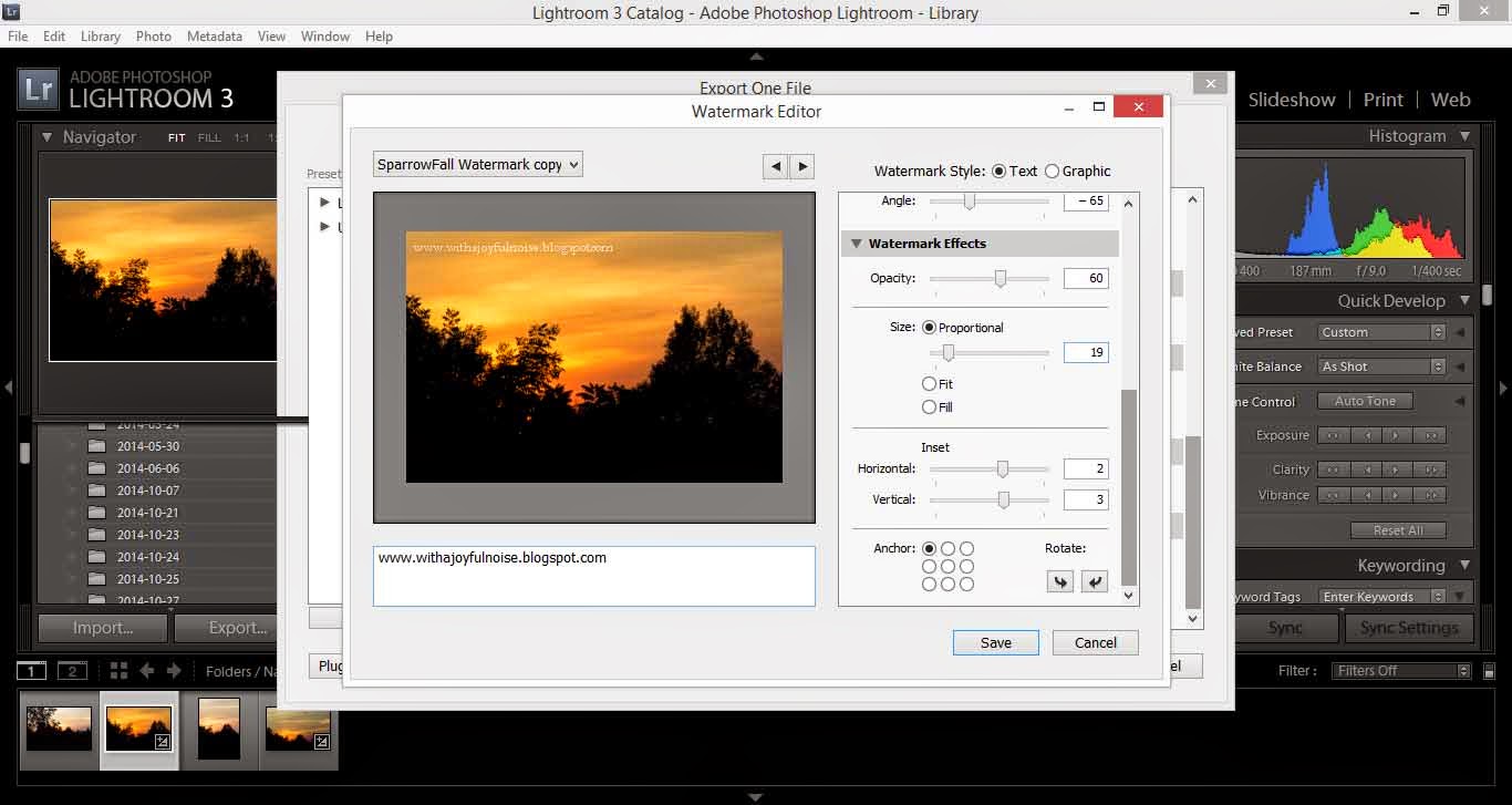
Step 20: Played with the fibers until it looked good.

Step 21: Lowered the opacity of the fibers

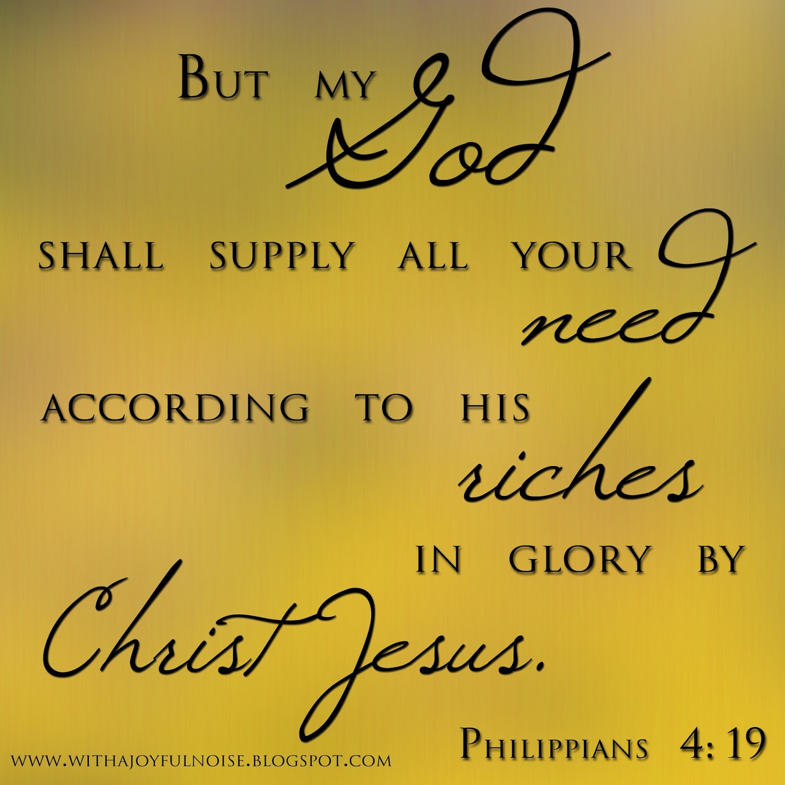
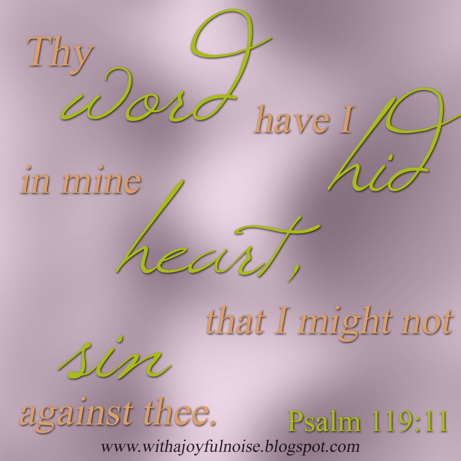
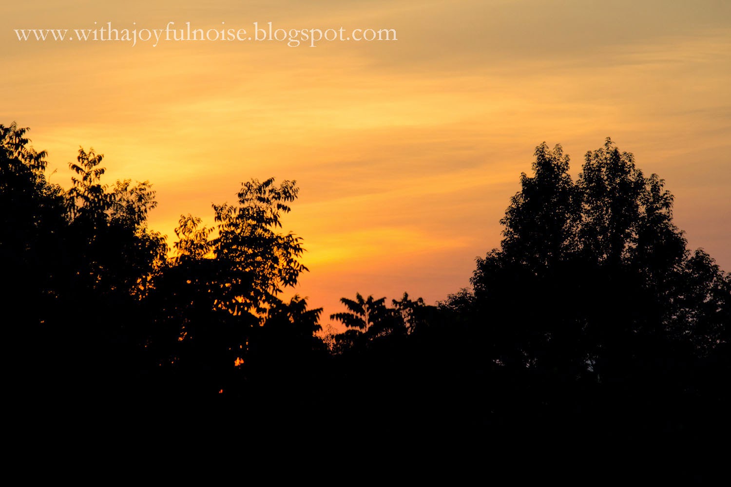
There you have it…another graphics design step-by-step.

Scripture Design from Scratch | Graphics Design

A few weeks ago, you may have seen this Scripture graphics design.
When I did it, I decided to screenshot the process so I could share with you–and hopefully you can get some ideas to do your own Scripture designs.
The program I used was Photoshop Elements 10.
First, I create a 4×4″ blank file (resolution at 500 pixels). Then, I dragged an image I had onto it.
I like to use random images for my background–they give creative textures. For this one, I went to Filter>Gaussian Blur.
I did a serious blur on this (106.8 pixels).
Next step: I copied the verse and pasted it onto the file.
I “took apart” the verse, enlarging the key words of the verse. This gave me a lot of text layers to work with.
This next step could have been done before or after, but I did it now. I had gotten a color palette idea from Pinterest. I don’t usually do this, but I wanted something different than my “earth tones” that I default to.
With my color grabber, I selected the purple.
Copying this purple color to my working page, I then grabbed the color replacement took (right click your paintbrush).
Selecting my background layer (lower right corner where it says “Layer 1”), I colored over the background this purple color.
Going back to the color palette, I chose some colors for text. The first color: orange.
I put all of my key words in font Windsong and changed the font color of those words to orange.
Second font color: green.
As you can see, I decided to swap my font colors. πŸ™‚ Green was a better key-word font and orange for the smaller words, in my opinion.
I didn’t want the background quite so bold, so I lowered the opacity of the background to 70% (lower left corner).
Right-clicking the fonts, I decided to add a drop shadow to make it pop from the background.
The only change I made was bringing the size up to 10 (from 5). I did this with all of the text.
Changed my reference color (whoops — forgot about that earlier).
Began tweaking the placement of all of the text.
Decided for the simple text to be in italics (Times New Roman font).
More placement tweaking.
And then I decided that the orange was a little too bright for my preference, so I dragged the color down to have a little more peachy-grey tones.
Added my blog site and voila! Here you have it.
Have you ever designed a Scripture graphics? Is it online somewhere that I can see it? If so, leave a link in the comment and I’ll check it out!
If you’ve not done one, and you have a program to DO one, here’s your assignment for next week: find a verse and create a graphics! (simple ;))

B&W with Color | Photoshop tutorial

Here is one look that I recently tried in my editing:

I showed it to a friend and she was interested in knowing how it was done. This is SO easy!
For this tutorial, I’m using Photoshop Elements 6.0 (due to some computer issues, I’m back down to an older version for now).

First, open your image in Photoshop.

Duplicate the layer.

If you’d like, name your new layer.

Be sure your top layer is selected.

Then go to “Create.” Here, you want to lower the saturation to be none (under “Color”).

Go back to your main editing window. Select the eraser. Again, be sure you’re on the top layer (Black and White layer). Now, erase away! You are erasing away the black and white picture and the color picture underneath will show.

Told you it was easy!! πŸ™‚

Next week, look for a couple of more pictures from this photoshoot. πŸ™‚

~*~
“Sing aloud unto God our strength: make a joyful noise unto the God of Jacob.” (Psalm 81:1)

Creating a Watermark in Photoshop Elements

Last week, we saw how to create a simple watermark in Adobe Lightroom. Using Photoshop is a little more complex but (in my opinion) is worth the better effects!

First, create a blank file (I did 4×6″).

Next, just for the ease of visuality, I colored the background.

Now it’s time for text! Find a text that you enjoy and that captures the genre of your photography.

If you like, add some extra little elements. I added a butterfly (with the elements shapes) and a swirl (using the text Nymphette) to create a fun, cute logo.

This will give you a few layers (see bottom right corner). Select all of your logo layers.

Right click and select “Merge Layers” (or press ctrl+E). This will pull all of your layers together so that you will not accidentally select only part of your logo.

With your logo selected, use the move tool (on the left it is the top left option – image of the cursor and “plus”). Right click on top of your logo and select “Edit layer styles.”

A new window will pop up.

Select “Bevel.” It automatically will give you a 5px bevel. I usually like this option so select “okay” when done.

Now, lower the opacity of your logo so that it is translucent. I selected 25% opacity.

From here, you can drag the logo from your workspace directly onto a photograph in Photoshop.

Another option is to prepare your logo to be used in Lightroom. First, crop the logo so that there is little excess space around the edges.

Then, hide the background layer (deselect the eye in the layer box). This will make your logo completely translucent.

Save your image as a PNG file.

When it gives you the PNG options, select “None.”

Now, back to Lightroom, go to the watermark window (same as when you made a simple logo). Under the first option, select “Choose.”

Open the PNG file that you just saved from Photoshop.

As with the simple watermark, you will need to play around with size and position until you get what suits you.

Save this as a new logo.

Export your picture (or hundreds of pictures) and there is your logo!

~*~*~
Casting down imaginations, and every high thing that exalteth itself against the knowledge of God, and bringing into captivity every thought to the obedience of Christ;Β 
(2 Corinthians 10:5)

Creating a Watermark with Lightroom

I’m gradually learning more and more in working with Adobe Photoshop Elements 10 and Adobe Lightroom 3 (both programs which I recommend for any photographer who is serious about their pictures). One of the “big things” right now with photographers is creating a watermark. You can do this easily in Lightroom if you are just looking for a simple watermark.
First, import your image to Lightroom.

After you have edited your picture, export your picture (under “file>export”).

In the window that opens, you have various options. Scroll all of the way down until you see the option “Watermarking.”

You will Β need to create a new watermark (or, if you have a watermark already – like I do – click to edit watermarks at the very bottom).

A new window will open. Notice that I circled the place where you will type in your watermark. I did “www.withajoyfulnoise.blogspot.com”

On the right, notice that you have various options: Image options (if you want to get advanced and have a logo instead of text), Text options (where you can select different fonts, styles, etc.) and if you scroll down . . .

. . . you will notice Watermark Effects (opacity, layout, etc.).

From here, you will play around with your watermark until you have placed it where you like, have it large or small enough, and so on. Just play around with it.

When it looks pretty, select “save.” It will pop up with a screen for you to title your watermark – this makes it easier the next time you decide to watermark you pictures: it will be there, ready and waiting.

Export your picture as usual and there you have it! Your picture has its watermark!

~*~*~
“Now the end of the commandment is charity out of a pure heart, and of a good conscience, and of faith unfeigned:” (1 Timothy 1:5)